Table of Contents
Introduction
In an earlier post, we examined weather soundings plotted on a skew-T diagram, which graphs the changes with height along a weather balloon’s path for several variables (air temperature, dewpoint temperature, and wind speed/direction). The skew-T is useful for visualizing a vertical profile of the atmosphere, but it only samples at one time. What if we want to see how variables change over time? A meteogram allows us to compare how multiple variables at the surface change over the course of a day. It allows us to make connections in the evolution of different variables.
The Meteogram
Although all meteograms display multiple graphs on a series of vertical panels, there is no single prescribed format. Different websites may include different variables, as available, and display them in a unique order, and sometimes with different units of measurement. The frequency at which the data are available also varies between sources. So when you go to view a meteogram, keep in mind that each source or website will have its own way of displaying data.
For a general overview of a day’s weather, I often turn to the hourly meteograms available from the Plymouth State Weather Center. One such example is shown below, for Columbus, Georgia, on the day of the April 8, 2024 solar eclipse.
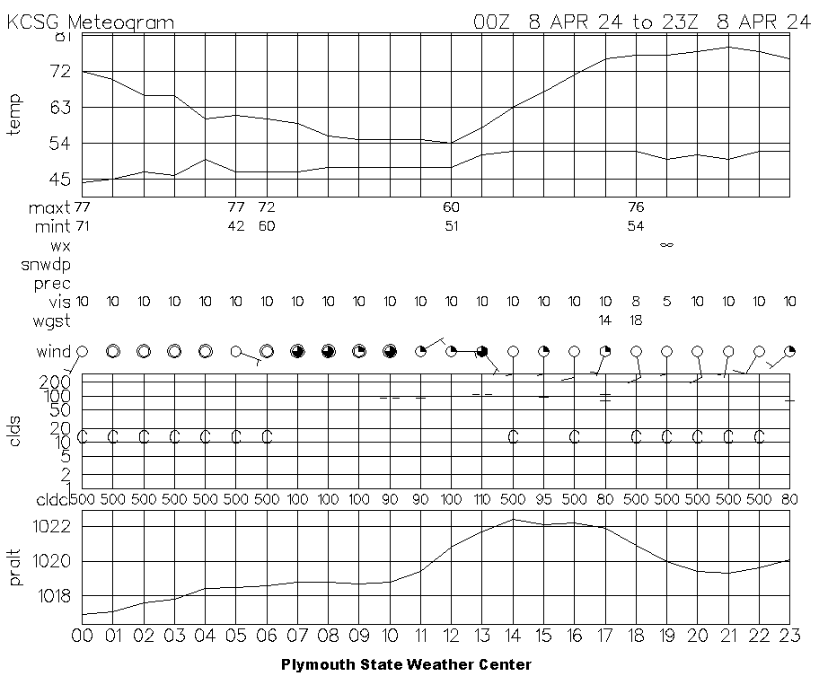
Source: Plymouth State Weather Center
As you can see, a meteogram is handy because it allows us to track several variables through time. On the Plymouth State meteogram above, the top panel displays the time series of air temperature and dewpoint temperature in degrees Fahrenheit. Below that, 6-hour and 24-hour maximum and minimum temperature, also in degrees Fahrenheit, are displayed. 6-hour temperatures are shown at hours 0, 6, 12, and 18, while the maximum and minimum temperatures for the previous day are shown at hour 5 or hour 6. Be careful not to be confused by the previous day’s temperatures: check the line graph and make sure it matches the maximum and minimum temperatures below!
The line labeled “wx” displays symbols to denote the present weather conditions, such as rain, snow, thunderstorms, drizzle, fog, haze, and more. The infinity symbol shown at hour 19 represents haze: there was a prescribed burn at Fort Benning, south of Columbus, on this day. (I published a journal article reporting on the combined effect of the smoke and the eclipse.) You can find a complete key decoding these weather symbols on the NWS Jetstream site.
The “snowdp” line reports the amount of snow on the ground in inches (if present). Below that, the “prec” line contains 6-hour and 24-hour reports of precipitation in inches. “vis” represents the visibility, measured in miles. On the meteogram above, the visibility is substantially reduced at hour 19 due to the smoke and haze.
The “wgst” line displays wind gusts, measured in knots. The “wind” line displays symbols depicting the direction the wind is coming from along with wind barbs that display the wind speed, also measured in knots. The extent to which the circle is filled in indicates the amount of cloud coverage. These symbols are described in detail in the Station Plots post.
The graph labeled “clds” shows the cloud coverage, with symbols representing the extent of coverage, plotted at the height of the observed cloud layer. The cloud heights are plotted in hundreds of feet: add two zeroes to the numbers on the y-axis. For example, the two side-by-side dashes plotted just below the “100” line at time 10 on the meteogram above represent mostly cloudy skies at about 10,000 feet. If no clouds are present, the sky is reported as clear, represented by “C”.
Below the cloud heights is the row “cldcl”, which depicts the cloud ceiling, the minimum height at which the sky is more than half-covered by clouds. If no clouds are present, “cldcl” is reported as “500”. As we saw for the cloud heights, one must add two zeroes to the “cldcl” values to find the cloud ceiling in feet.
The bottom graph on the meteogram displays the station pressure in hectoPascals or millibars, which are equivalent. The numbers along the bottom of the graph are the time in Universal Time Coordinate (UTC), which is, for all practical purposes, the same as Greenwich Mean Time (GMT). To translate a Plymouth State meteogram to your local time, you will have to convert from UTC to your time zone.
Why did the meteorologist replace telegrams with meteograms at the TV station?
He figured if the viewers wanted a message, they’d appreciate it more with a 3-hourly temperature plot and a humidity forecast! 📈
Meteogram Applications
Meteograms are generally useful for understanding how weather conditions change, but they can be especially helpful in specific contexts.
Diurnal Cycles
Meteograms show how the air temperature, dewpoint temperature, wind, pressure, and other variables change from morning through afternoon and into the night. They indicate how radiation from the sun affects the air temperature and other conditions during the day and how much radiational cooling occurs overnight. Thus, they are great for observing day/night (diurnal) cycles.
Simultaneous Trends in Variables
Meteograms make it easy to see how different variables are affected at the same time. When rain begins, one may observe the temperature to fall due to the evaporatively-cooled cold pool that often accompanies precipitation. At the same time, the dewpoint temperature may rise, indicating increased moisture in the air, the wind may pick up in speed or change direction, and the visibility may decrease. Meteograms make the detection of simultaneous shifts in the weather easy to spot.
Frontal Passages
When a cold front passes, many variables tend to change rapidly. The air temperature usually falls soon after a cold frontal passage, as does the dewpoint temperature. The cold front is often marked by an abrupt shift in wind direction and an increase in wind speed, often with gusts. The barometric pressure usually experiences a dip, bottoming out as the front passes. While not every cold front produces all of these changes simultaneously, they are often present around the time the front passes. The passage of a warm front is usually less distinct and harder to identify on a meteogram than that of a cold front.
Downloading a Meteogram
To display or download a meteogram from the Plymouth State Weather Center, you will need to know the station identifier for the station whose data you wish to display. For many weather stations, the station identifier is identical to the three letter airport code, and all stations in the continental U.S. use the prefix “K”. As you can see on the meteogram above, the station identifier for Columbus, Georgia is KCSG. To display a meteogram near you (if you’re in the continental U.S.), your best bet is to look up the airport code for the nearest city and add a “K” to the beginning.
The link in the previous paragraph is for archived data for a previous day; if you want the most recent data, go to the Recent Meteograms page instead. Thanks to the meteorology program at Plymouth State University (in New Hampshire) for making this and so much more data available!
Many states also maintain dense networks (by meteorological standards) of surface weather stations known as mesonets. Each network maintains its own website where current data are displayed. Many of these websites display meteograms of recent data, though the format varies from one state to another. Data for past events can typically be requested by contacting someone with the network or via a web form. Here’s a list of active state mesonet websites. Happy meteogram hunting!
Review Quiz
Now that you know your way around a meteogram, you can test your knowledge with the quiz below, using a meteogram from the day of the Joplin, Missouri EF-5 tornado in May 2011.

Leave a Reply