
Winds on the Station Plot
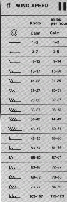
Winds are plotted similarly on station plots, on meteograms, and on skew-T diagrams. The winds are plotted along a line extending from the central station-plot circle, pointing in the direction that the wind is coming from. One or more barbs usually extends off of this “stem” to indicate the wind speed. A short barb represents approximately 5 knots, and a long barb represents approximately 10 knots. A triangle, or “flag”, represents approximately 50 knots.
The values of all flags and barbs are summed to find the total wind speed. If the circle of the station plot is surrounded by another circle, the winds are calm.
Cloud Cover on the Station Plot
Cloud cover used to be determined by a human observer scanning the 360-degree panorama of the sky and visually estimating the sky coverage. Beginning in the 1990s, Automated Surface Observing Stations (ASOS) were deployed at airports and other weather stations around the U.S. The ASOS stations include a ceilometer, which sends pulses of near-infrared radiation directly upward. This energy is backscattered when it encounters clouds, returning the energy to the surface. By this means, cloud heights can be detected.
The ceilometer has two primary limitations: 1) because it sends the near-infrared radiation straight upward, the ceilometer can’t detect clouds toward the horizon; and 2) the ceilometer’s beam only penetrates to a height of about 12,000 feet, so cirriform and higher altostratus/altocumulus clouds escape detection.
What are some names of sky coverage amounts?
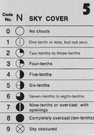
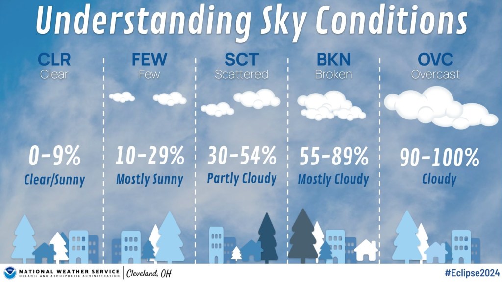
The names illustrated below represent the total cloud coverage. CLR represents very little or no clouds; FEW represents 1/8 to 2/8 coverage; SCT (short for “scattered”) represents 3/8 to 4/8 coverage; BKN (“broken”) represents 5/8 to 7/8 coverage; and OVC (“overcast”) represents completely cloudy skies. To observe cloud cover yourself, check out this brief guide.
Pressure Tendency on the Station Plot
When we look at the “tendency” of a variable in meteorology, we’re considering the rate of change of the variable through time. Specifically, the pressure tendency is a measure of how the barometric pressure has changed in the last three hours.
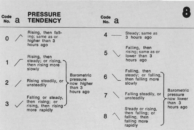
The pressure tendency is displayed to the right of the circle in a station plot. There are two components to a pressure tendency measurement: first, the amount of pressure change over the last three hours in millibars is shown to the nearest tenth, followed by a symbol (shown above) that displays how the pressure has changed over the past three hours. As you can see above, the pressure can remain constant, increase, decrease, or some combination thereof.
Why do meteorologists care about pressure tendency?
There are three common uses for pressure tendency:
1) Pressure tendency may indicate an incoming low pressure system by a decrease in pressure (which may be associated with worsening conditions), while a steadily rising pressure may indicate an incoming high pressure system (which may be associated with clearing conditions).
2) Large decreases in pressure tendency indicate a rapidly intensifying large-scale storm or an approaching strong storm. If a storm is intensifying, its pressure gradient is increasing, and its winds are getting stronger.
3) Pressure tendency can be used to predict storm motion. Large-scale storms (lows) tend to move toward where the pressure is decreasing the most rapidly, and large-scale highs tend to move toward where the pressure is increasing the most rapidly.
Present Weather on the Station Plot
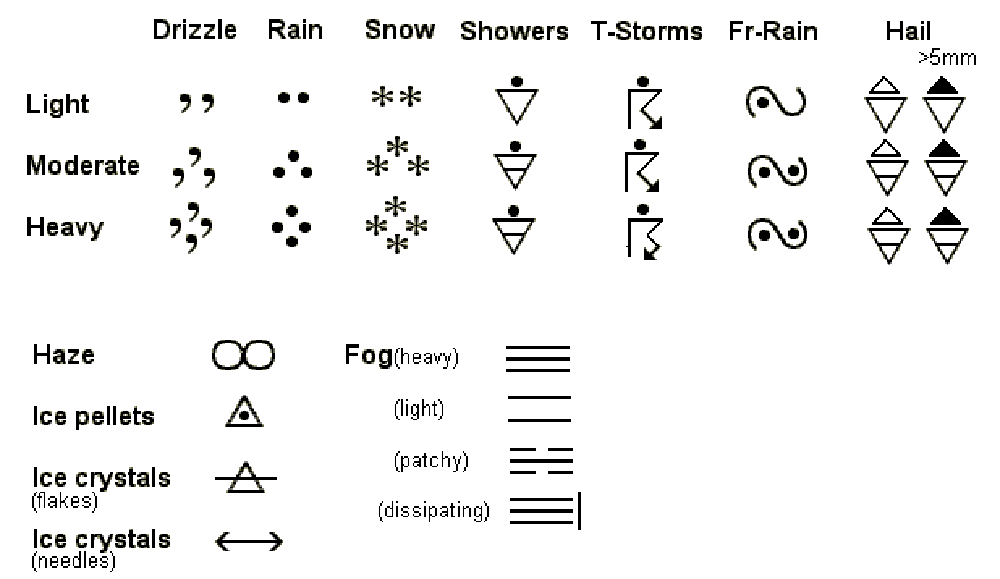
While the previous sections described how the “state variables” (temperature, moisture, pressure, and wind) are plotted on a station plot (along with cloud cover), now finally we get to the kind of weather you may care most about: rain, snow, drizzle, hail, fog, and other types of weather that impact our lives most directly.
Each precipitation type is given its own symbol (see above), and the intensity of precipitation is given by the number of those symbols that are shown. For example, light rain is designated with two dots, moderate rain with three, and heavy rain with four. These symbols are displayed to the left of the circle on a station plot. If no precipitation or other current weather is observed, the present weather field is left blank.
Station Plots on Weather Maps

A handy feature of station plots is that they are compact so as to be plotted for different cities on maps. The map above shows the conditions at 4 pm EDT on the date of the April 2024 eclipse that provided a once-in-a-lifetime experience to viewers from Texas through the Northeast and into Canada. Cloud cover at this time varied from none (in Tampa, FL) to overcast (in Knoxville, TN and New Orleans, LA). Temperatures ranged from 82 degrees Fahrenheit to 59 degrees F in Knoxville.
Anomalies, like the cool temperature in Knoxville, stand out on station plot maps. With visual scanning, gradients in temperature, dewpoint, pressure, and cloud cover become apparent. Station plot maps provide an easy way to diagnose conditions across a state or region.
To plot a map of station plots like the one above, follow this link to the Plymouth State Weather Center. Select the region for the plot, and choose “Station Plot” for Variable. Specify the year, month, day, and time of the observation. (Note that the times are in Zulu, or Universal Time Coordinate. For instructions on how to convert from your local time to UTC, see the Time Zone Conversions blog post.) Once you’ve made your selections, use the “Click Here to Make the Map” button.
Review Quiz

You must be logged in to post a comment.