
What You’ll Learn in this Post
- How to determine layers of the atmosphere where clouds are more likely to form
- How to compare data from a weather balloon with a cloud photo to determine whether the weather balloon data support the observations in your cloud photo
- Why local clouds and the data collected by the nearest weather balloon may not match
- How obtain skew-T diagrams for comparison with cloud photos
Introduction
Now it’s time to combine information from the first four Five-Minute Meteorology posts. Can data from a skew-T diagram inform our understanding of a cloud formation in the sky?
Table of Contents
I recorded the video below on a pleasant winter’s day in Georgia. The clouds pictured are mid-level clouds, a combination of cumuliform and stratiform. There are multiple broad bands, with streaks of clear air in between. The cumuliform clouds tend to occur on the periphery of the stratiform bands. A meteorologist would classify these as altocumulus clouds surrounding bands of altostratus, or perhaps just as altocumulus.
Connecting the cloud video to skew-T diagrams
Understanding how skew-T diagrams relate to cloud formation can enhance your knowledge of cloud behavior.
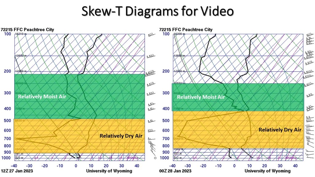
Below are two skew-T diagrams from the Peachtree City, GA weather balloon observations on this date: the morning observation (12Z) is on the left, and the evening observation (00Z) is on the right. On the graphs, you can see that the air temperature and dewpoint temperature lines (the bold, jagged lines on the graph) are relatively far apart towards the bottom of the graph and much closer together in the middle to the top of the graph.
When the air temperature (on the right) and the dewpoint temperature (on the left) are close to each other, the air is close to saturation. When they are far apart, the air is quite dry (far from saturation). The yellow and green shading emphasizes these dry and moist regions, respectively. As we’ll see in the next post, the proximity of the air temperature and dewpoint temperature lines is indicative of the relative humidity (RH): when they are closer together, the RH is high; when they are far apart, the RH is low.
What did the lower dry layer say to the upper moist layer? (Click to expand)
Lower dry layer: “Why are you always floating up there?”
Upper moist layer: “Well, I like to rise to the occasion, unlike you down below, stuck in your dry humor!”
Lower dry layer: “I guess we just have different atmospheric stability levels. You’re all about reaching new heights, while I prefer keeping things down to earth!”
Recall that the video above shows mid-level clouds. At the middle to upper levels on the skew-T diagrams, we see relatively saturated air (the air temperature and dewpoint temperature lines are relatively close together), which would support cloud formation at mid- to upper-levels. This is a simple, straightforward way that you can understand how atmospheric conditions produce clouds.
| Pressure | Height | Possible Cloud Types |
| 1000 – 750 mb | 0 – 6500 ft 0 – 2000 m | Cumulus, stratus, stratocumulus |
| 750 – 400 mb | 6500 – 20,000 ft 2000 – 6000 m | Altocumulus, Altostratus |
| 400 – 100 mb | Above 20,000 ft Above 6,000 m | Cirrus, cirrocumulus, cirrostratus |
The table above shows the pressure and height ranges associated with the primary cloud types. You can use this table to match your visual cloud observations with the data on a skew-T diagram. If you see cumulus clouds, for instance, you should look below 750 mb, 6500 feet, or 2000 m on your skew-T for relatively moist air.
The easiest way to compare is by using the pressure column in the table and comparing those values with the pressure on the skew-T diagram (the bold blue numbers on the left of the graph). For the video at the beginning of this post, which contains altostratus/altocumulus clouds, we expect them to be located between 750-400 mb (from the table). Looking at the skew-T diagram above we can see that the air is moist between about 480-220 mb. This range overlaps with the values from our table. We can therefore confirm that our quantitative data from the skew-T and the qualitative cloud type from our observation agree.
It’s relatively easy to combine your understanding of how to identify more saturated air on a skew-T with your ability to classify clouds to make some simple interpretations about cloud behavior. As you make more observations, you might be able to make more advanced connections, such as how wind and wind shear play a role in cloud development.
This understanding is crucial for predicting various cloud types and their implications for weather forecasts.
Note that the values in the table above are approximate. Actual cloud heights of different cloud types may be somewhat higher or lower than listed owing to daily, seasonal, and location differences. Knowing the characteristics of different cloud types will help you interpret skew-T diagrams more effectively.
I took a photo of a cloud, and the moist air on the skew-T doesn’t match…why? (Click to expand)
There are three primary reasons why local clouds and the data collected by the nearest weather balloon may not match:
1) A large time difference between when the photo was taken and when the skew-T data was observed. Since weather balloons are usually launched only twice per day, the data collected on the balloon launch may not be representative of the sky conditions at the time of your photo. As a result, the moisture shown on your skew-T may not adequately reflect the sky and cloud conditions at the time of your photo.
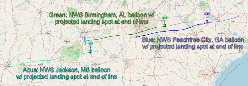
2) There could be a large distance between your location and the location of the balloon observation, especially on a windy day. The weather balloon will drift with the movement of the air. For high clouds, the balloon could be pushed a few hundred kilometers away from where the it was launched, especially if it’s a very windy day. So even if the sounding site is nearby, the balloon may be reflecting conditions quite far from your location.
The graphic below shows the path of travel of weather balloons launched from Jackson, MS, Birmingham, AL and Peachtree City, GA (near Atlanta) on January 18, 2024. Winds were observed to be 158 mph at around 39,000 ft, so the balloons traveled quite far. You can track the progress of the day’s morning and evening weather balloon launches at the SondeHub website.
3) Local atmospheric conditions could produce moister or drier air than was measured by the balloon. Sometimes, there can be large variability in conditions over small distances. For example, cumulus clouds often pop up during the afternoon in areas where the morning skew-T is relatively unsaturated.
Plot a Skew-T Diagram
We’ll dig deeper into the uses of skew-T diagrams in later posts. If you want to take a photo and see how the skew-T matches it, you can download the skew-T plot from the University of Wyoming website. Just be sure to select the date and time of your photo and choose “PNG: Skew-T” under “Output Type”. Enter the data and time, then enter the station number nearest to your location. You can view the station numbers by mousing over the stations on the map.
Note that these data are typically available twice per day: 12Z for morning; 00Z for evening in the U.S. [The Z stands for Zulu time, which is the same as Universal Time Coordinate.] To interpret your photo, you’ll also have to convert the time from the local time of your photo to UTC time. If you take a photo at 4:00 pm EDT, for example, you’ll have to convert to UTC time by adding 4 hours: 8:00 pm GMT, or 20:00 UTC. If you took the photo at 4:00 pm on April 3, the closest skew-T observation time would be 0:00 UTC on April 4.
Take the quiz below and test your knowledge of clouds and skew-T diagrams.

In the next installment, we’ll look in more detail at how meteorologists measure atmospheric humidity in a discussion of dewpoint temperature and relative humidity.


You must be logged in to post a comment.