Data Interpretation
Mapping Weather: Station Plots

This blog post explains the concept of station plots in meteorology, detailing how various weather data like temperature, pressure, wind, and cloud cover are visually represented on weather maps. It outlines the methodology for creating these plots and emphasizes their importance in tracking weather patterns, forecasting, and analyzing atmospheric conditions across different regions. Continue reading
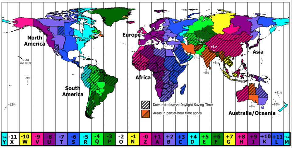
Time Zone Conversions
Most meteorological observations are reported in Coordinated Universal Time. We live in reference to local time. As a result, it’s important to know how to convert between time zones. Continue reading
Five Minute Meteorology: Wind Basics
Winds are measured using nautical miles per hour, or knots, and require both speed and direction measurements. Wind vane (direction) and anemometer (speed) are commonly used devices. Symbols on maps and graphs represent wind speed and direction. Wind is one of the state variables. Continue reading
Five Minute Meteorology: Barometric Pressure Basics
Barometric pressure is probably larger than you realize. Standard sea level pressure is 14.7 pounds per square inch. So, if the surface area of the top of your head measures about 175 square inches (the size of an average human head), then you have 2572.5 pounds of air weighing down your head all the time! Continue reading
Five Minute Meteorology: Temperature Basics
Have you ever tried to cook food at high altitude? You may have needed to add salt to your boiling pot of water.. but why? Continue reading
Overview: Clouds and Moisture
Understanding clouds lends insight into basic principles of atmospheric behavior that govern many other atmospheric processes. Continue reading
Clouds and Skew-T Diagrams
This post combines information from previous posts and connects these concepts to a video of a cloud formation. It examines skew-T diagrams from Georgia, showing how air and dewpoint temperatures relate to the cloud formation. The post encourages readers to plot their own skew-T diagrams to understand atmospheric conditions that produce clouds. Continue reading
A Basic Skew-T Primer
Meteorologists rely on weather balloon observations, known as “soundings,” to gather direct evidence of current weather conditions at different atmospheric heights. Graphs like the Stüve diagram present challenges in representing this data. The skewed temperature axis on the skew-T diagram addresses this issue, providing a more upright depiction and additional detail. Continue reading


About Me
I’m an assistant professor of meteorology at a small university. This blog is meant to serve my students and anyone who finds it useful.
Recent Posts
Newsletter
[userfeedback id=1]
You must be logged in to post a comment.