
What You’ll Learn in This Post
- How to plot temperature, dewpoint, and wind observations on a Stüve diagram
- How a skew-T diagram is different from a Stüve diagram
- How a skew-T diagram can be used in different applications
- How to download a skew-T diagram from the internet
Introduction
To forecast the weather, meteorologists rely on data collected directly from the atmosphere. We collect this data by launching weather balloons, usually twice per day. These weather balloon observations, called “soundings” and often plotted as skew-T log-p diagrams, give meteorologists direct evidence of the current weather conditions at different heights in the atmosphere. This is important because most of the weather happens above the ground, while we live on the surface.
Table of Contents
A Simple Graph of Pressure vs. Height: The Stüve Diagram
The graph below contains data from Blacksburg, VA (station abbreviation: RNK). The balloon was launched at approximately 1200 Universal Time Coordinate (UTC time) on May 3, 2022. UTC time (or “Zulu” time) is based in Greenwich, England and does not observe Daylight Savings Time. You’ll know the time of the sounding from the bold black number (12Z) next to the date at the lower left on the graph below.
It can be challenging to graph these data, because the atmosphere is heated from the surface upward and tends to get increasingly colder with increasing height. As you can see in the image below, the graph is highly tipped over, representing a strong decline in temperature with height.
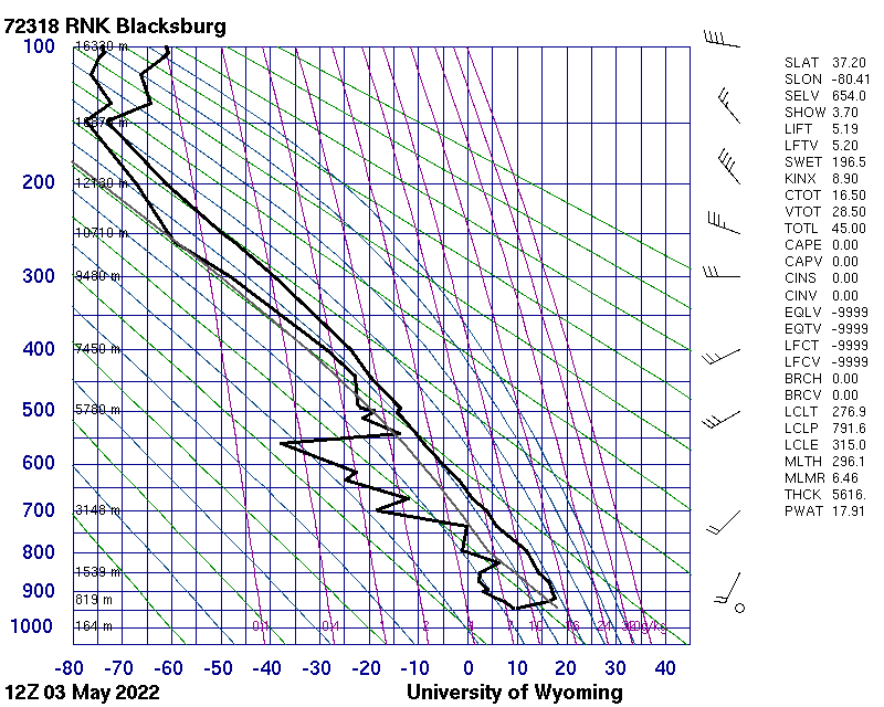
The graph above is called a Stüve diagram. It shows the temperature (x-axis) versus the pressure (y-axis). Two temperatures are plotted: the air temperature (right bold line) and the dewpoint temperature (left bold line). The dewpoint temperature is shown to represent moisture in the atmosphere. Meteorologists often use pressure, rather than height, as the vertical coordinate. The pressure is shown by the blue numbers at the left of the graph, which decrease with height. This decrease occurs because at higher elevations, there are fewer molecules above to “weigh down” from above onto a given level. Notice that the pressure lines spread out higher in the graph. This is because pressure decreases exponentially with height, so the values decrease at a slower rate higher in the atmosphere.
![[Labeled Stuve diagram]](https://understandingtheweather.org/wp-content/uploads/2023/05/annotated_stuve_diagram.png?w=960)
Just to the right of the blue pressure numbers are smaller black numbers showing the height in meters. Along the bottom of the graph, the blue numbers show the temperature in degrees Celsius. Just to the right of the graph are symbols indicating the wind speed and direction. The circle at the bottom of that column indicates calm winds (or a lack of wind). Finally, the numbers at the far right show various computed quantities from the data.
Which line is which again? (Click to expand)
The temperature line is on the right and the dewpoint temperature is on the left.
The Skew-T Diagram
We have a problem: anytime we try to plot temperature versus height in the atmosphere, the graph will tip over dramatically to the left. Can we tilt the data to be more upright?
Below is a basic image of a “skew-T” diagram without any data plotted. It shows the height on the y-axis and temperature on the x-axis. Notice that the height scale in kilometers is the same on the left and to the right of the plot. Heights in thousands of feet are also shown on the right. Notice the diagonal lines from lower left to upper right: that’s our new, tipped-over temperature axis. It’s called a “skew-T” because the temperature axis is “skewed”, or slanted at a 45-degree angle. This will allow the temperature and dewpoint temperature data to be more upright when plotted than on the Stüve diagram above.
![[Blank skew-T diagram]](https://understandingtheweather.org/wp-content/uploads/2023/05/basic_skew-t_hgtvstemp_hires.jpg?w=1024)
The graph below might give you a better sense of scale. On the left, pressure is plotted instead of height. Notice that the diagonal temperature lines are evenly spaced, and that the horizontal pressure lines spread out with increasing height. A skew-T is technically called a “skew-T log-p” diagram because the pressure numbers are logarithmic. But we’ll keep it simple and refer to them as skew-T diagrams.
What did the skew-T diagram say to the Stüve diagram? (Click to expand)
Skew-T: “Hey, Stüve, why do you always approach things from the same angle?”
Stüve: “Well, I believe in consistency and clarity.”
Skew-T: “Ah, I see. Well, I like to give forecasts a different slant. Keeps things interesting, you know?”
![[Blank skew-T diagram]](https://understandingtheweather.org/wp-content/uploads/2023/05/basic_skew-t_pressurevstemp.jpg?w=1024)
Finally, the plot below shows how the freezing line (diagonal black line) is slanted in our new skew-T diagram, like all temperature lines (known as isotherms). In the red region, the air is above freezing. In the blue region, the air is below freezing.

Now let’s plot the same data as in the first image in this post on a skew-T diagram, and we’ll highlight where the weather balloon noted important data points with circles. On the skew-T below, we also plot a colorful vertical ribbon showing the wind speed. There is much more detail in the wind data at the right of this graph than in the Stüve diagram that started this post.

So how can I use skew-T diagrams? (Click to expand)
Because they record observations throughout the troposphere, skew-T diagrams are used in many applications. Here are some that you will encounter in later chapters:
* Estimating cloud heights and identifying moist layers where clouds may form
* Identifying wind shear[link] – changing wind direction with height
* Identifying the height of the tropopause[link]
* Estimating the lapse rate and stability[link] of the atmosphere – how does temperature change with increasing height?
* Identifying the three types of inversions: radiation inversions[link], subsidence inversions[link], and frontal inversions[link]
* Predicting the likelihood of severe thunderstorms and tornadoes[link]
Comparing the Stüve and Skew-T Diagrams
Here’s a side-by-side comparison of this skew-T we just plotted (left) and the original Stüve diagram (right) from the beginning of this post. Notice that the skew-T brings the temperature data more upright, but exaggerates the differences between the air temperature and the dewpoint temperature.

We’ll add one more wrinkle to the mix, by plotting a graph of the wind speed (blue line) to the right, between our temperature data and the wind data. Notice that the colors in the vertical wind speed ribbon correspond exactly to the changes in the wind speed on the wind speed graph because we are plotting the same variable.

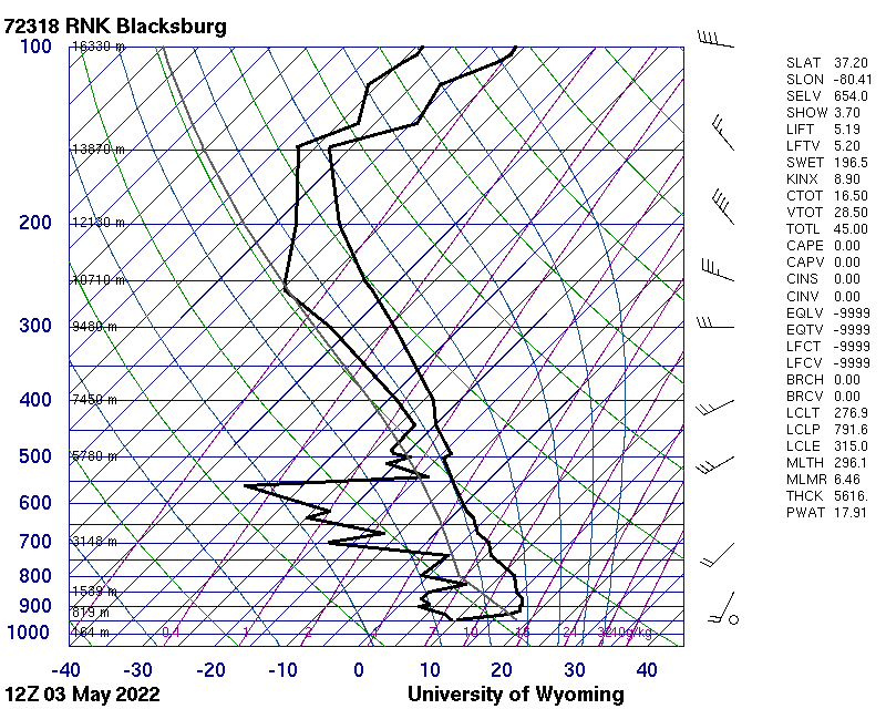
Finally, we have below the skew-T generated by the University of Wyoming sounding website for the same station and time as the Stüve diagram that started this post. This diagram has some extra background lines that are used in interpreting the stability (and, therefore, the potential for vertical motion) within the atmosphere. The temperature axis is indicated by the blue lines slanting upward and to the right at a 45 degree angle. You can go to the Univ. of Wyoming link above and play around to your heart’s content…but if you want a skew-T, be sure to change the “Output Type” to PNG: Skew-T.
In the next installment, we’ll apply our knowledge of skew-T diagrams via an example that compares a skew-T plot to a video of some clouds around the same time.

You must be logged in to post a comment.